If you wanted to know the state of supplier pricing what would you do?
That’s the question we asked ourselves here at Orderly.
And our solution was simple… use the information we’ve gathered in the Orderly App to pull together a report on supplier pricing.
So we analyzed 357,806 supplier purchases from over 4,100 restaurants in our system.
Here’s what we can tell you about pricing.
WHAT WE DID
First, we had to set up parameters.
After all, it’s no use analyzing 357,806 supplier purchases if the data wasn’t going to be statistically relevant.
So we only included ingredients that had a minimum of 10 purchases… from 10 different suppliers… and 10 different restaurants.
Oh, and did we mention it all had to have happened within the last two weeks.
What we wound up with was a big ole pile of information… 357,806 total purchases from 4,207 distributors and 92,357 ingredients.
With that criteria, we had a broad set of data on which to report.
In other words, it’s legit.
WHAT WE FOUND OUT
After spending time analyzing the data (lots & lots of time), we came to realize something about the state of supplier pricing.
What we learned amazed us… but not in a good way.
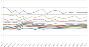
Take a look for yourself. This graph shows the prices of Ground Beef.
Sure, this graph may look like a bunch of jumbled lines at first glance.
But take a closer look.
You’ll see there’s a whole bunch of lines grouped together at the bottom of the graph… these represent the statistical majority of restaurants that are in our system.
The lines get fewer and more spread out the farther up the graph you go… these are the few restaurants who are paying different prices than everyone else in our system.
What this graph is showing us is that the majority of restaurants we have statistically relevant information on are paying within a dollar range of each other for ground beef… not that bad.
The bad news is that the fewer restaurants who are paying more for ground beef… are paying A LOT more… in some cases, $3 more per pound.
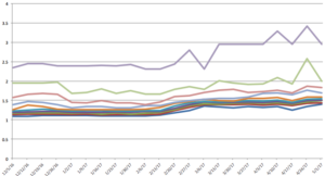
And this is happening on more items, too. Take for example Chicken Breasts.
We can see from the thick group of lines on the bottom of the graph that most restaurants we collected data on are paying about the same price for a pound of chicken breasts.
But there are a few restaurants who are paying more for these items… and again… they’re paying a significant amount more… over $1 more in some cases.
Note: If you buy higher quality chicken, then you wouldn’t be listed here. We group together like ingredients… so the graph above only includes items in our system labeled as “chicken breasts – random.” Anything else labeled under chicken breasts in our system is considered it’s own group and reported on differently.
WHAT THIS MEANS
If you’re one of the restaurants in the majority, then you can rest easy… you’re paying what everyone else is paying.
But if you happen to be in the minority of restaurants who are paying not just more for their food… but a good bit more… you need to dig a little farther.
Why are most restaurants paying about the same rate for certain items… But others are paying a lot more for these same items?
Our guess is that the restaurants who are paying a lot more don’t check these items on a regular basis.
In other words… suppliers may increase the price… and the restaurants don’t really know or care that they’re paying too much.
That’s a big no-no.
Food costs represent 1/3 of your operating budget.
Acumen in the area of food costs and pricing plays a crucial role in the financial success of your restaurant.
Making sure you stay out of the statistical majority is a matter of managing your top 20 – 40 ingredients by dollar volume and making sure you’re getting fair pricing on these ingredients by doing quarterly supplier reviews.


