Say “BIG DATA” to a restaurant owner…
And they’ll likely say “BIG DEAL”… as in “who cares”?
Unless that big data can translate into BIG MONEY… then you have their attention.
Here at Orderly, we’re knee deep in big data every day. Specifically BIG PRICING DATA. Like the pricing data gathered from thousands of restaurants who are paying their suppliers every day.
Pricing data on key ingredients… stuff everyone buys… every week… from the same suppliers.
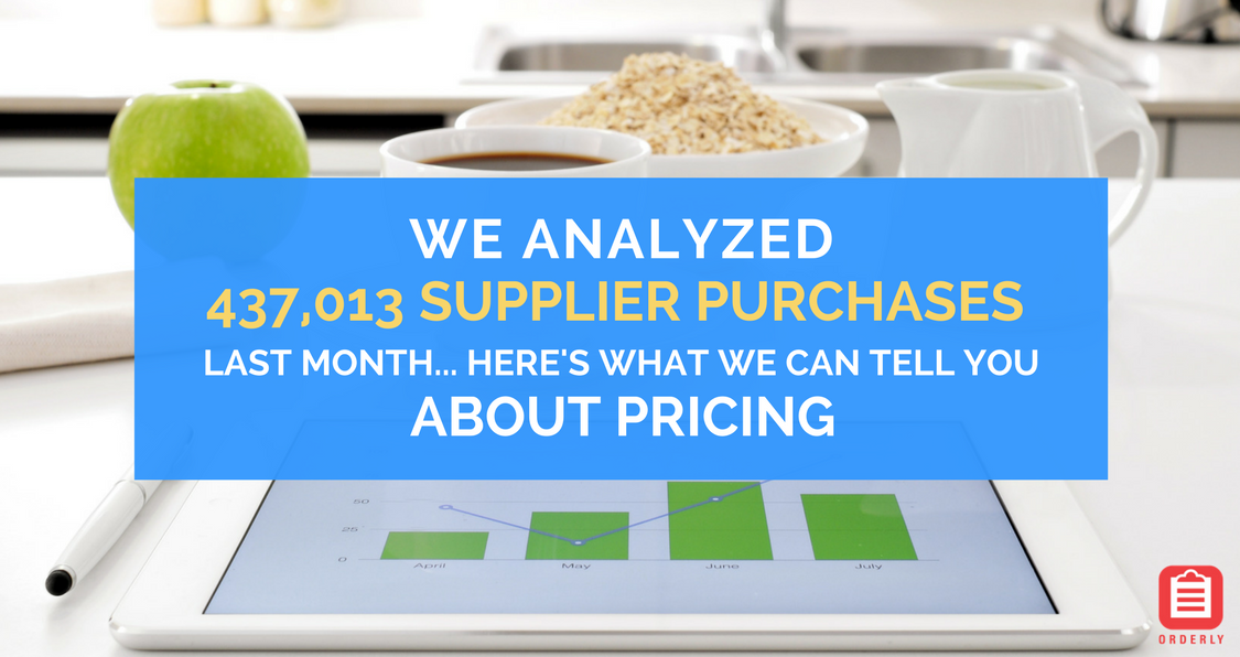
And we took a look at over 437,013 restaurant supplier purchases last month… these were real purchases made by over 4,100 restaurants in the US in the last 30 days…
And this BIG DATA had some BIG PRICING revelations… it’s the stuff you can use to run a more profitable restaurant… negotiate a better price… and quit overpaying for supplies.
The first thing we found was that 92% of restaurants are overpaying for their supplies…
Yes… 92% pay more than other restaurants in their local market for the same item from the same supplier… seems crazy… but it’s true.
There were a lot of other eye-opening revelations… we will highlight some of them here. But what we really encourage you to do is download the free app and check it out for yourself.
So, BIG DATA isn’t so bad after all… it has BIG BENEFITS… ones the average restaurant can take advantage of.
Instead of “who cares”, it’s more like “three cheers” to BIG DATA… and here’s what we can tell you about supplier purchase data for October 2017…

WHAT WE FOUND OUT
Our data team spent hours of their time reviewing and analyzing invoice purchase data gathered in the Orderly App.
What we learned was pretty eye-opening… like smelling salt eye-opening…
Let’s start with some background.
Here’s how we graphed the data in our Restaurant Food Index (RFI):
- The top line represents the top 30% of prices being paid
- The green line is the average LOCAL pricing for the ingredient
- The bottom line represents the bottom 20% of prices being paid
Take a look at how American Sliced Cheese has been trending in the RFI:

In the United States, there’s an 18% variance between the lowest price paid at $2.18, compared to the highest paid at $2.66. The median trend for the U.S. (where you want your prices to be) is anywhere from $2.24 – $2.37.
So what does that mean?
What this graph is showing us is that all the restaurants that we have statistically relevant data on, are paying within $0.50 of each other for sliced cheese… not that bad.
But not all ingredients are the same. Take paprika for example. There’s a 61% variance in the amount paid by the lowest and highest purchaser.

From the graph above, you can see how wide the range is from the bottom 20% purchasers to the top 30% purchasers.
The top 30% of restaurants are paying more for this item… they’re paying a significant amount more… over $7 more in some cases.
Fluctuation in supplier purchase pricing is shown in our RFI as well. Take for example sour cream, a basic staple of many restaurants…

As you can see from the graph above, there is a $0.40 variance nationally between the highest and lowest price available.
What’s more surprising is the trend line for local pricing in Georgia. Prices have trended upwards of 21% within a 3-month period. As restaurant owners, understanding these numbers will help you to make better decisions on what products to buy from each of your suppliers.
WHAT THIS MEANS
If you’re one of the restaurants in the median, then you can rest easy… you’re paying what everyone else is paying.
But if you happen to be in the majority of restaurants who are paying not just more for their food… but a good bit more… you need to dig a little farther.
Why do some restaurants pay more for the same items other get significantly cheaper?
Our best guess is that these restaurants don’t have the time to check food prices on a regular basis… or trust that they are getting the best price.
(Note: If you’re buying higher quality cuts of meat, these items are grouped separately. Each item in our Restaurant Food Index is grouped by specific type. Here’s an example for sour cream.)

In other words… suppliers increase prices… and restaurants are none-the-wiser. They either don’t know they’re being overcharged or they don’t mind being overcharged.
And that’s a big no-no…
Food represents more than ⅓ of your restaurant’s operating budget.
Understanding your food costs plays a critical role in the financial success of your restaurant.
What can you do?
Make sure you’re managing food costs on your top 20-30 ingredients by dollar volume. It’s also helpful to do a quarterly business review.
HOW CAN I GET I GET MORE
Because managing food costs is so important to the success of restaurants, we decided to put all this data in a monthly report.
It’s called the Restaurant Food Index and it’s the first and only supplier price index.
It’s like the Consumer Price Index… but for restaurant supplier purchases.
It’s a definitive guide to supplier pricing. The RFI is compiled from data on hundreds of thousands of real monthly supplier purchases. It tells you what restaurants are really paying.
It provides a national and local view of price trends on 100 of the most popular ingredients.
And you can get the report for FREE… just click the link below… grab a chair… and dig in.
(You’ll likely need the chair… and maybe a drink… because you’re about to see the real truth about pricing.)
From our analysis on 4,100 restaurants… we know that 92% of restaurants overpay their suppliers…
You’re going to likely find there are 5 – 15 items you’ve overpaid on… and this will likely result in thousands of dollars lost. (I told you, you might need that drink).
WHAT HAPPENS NEXT
We’ll keep analyzing supplier purchases and we’ll provide some monthly updates. We’ll keep you informed of what we see.
But there is something even better than our report – it’s our free inventory and price compare app.
When you download the Orderly App… it shows the RFI pricing data… right in the palm of your hand… but it even takes it one step further…
It will overlay your existing ingredient data onto your local market pricing… in real time… so you can see if you’re getting fair local market pricing.
Find out if you’re in the top 25% of prices being paid (not so good)… or the middle 50% (meh, you’re ok)… or the bottom 25% (ah, the sweet spot)…
So now you’ll know if you’re overpaying for ground beef, eggs, onions, and over 100 ingredients.
Look at the report… download the free app… and check the pricing on your supplier purchases.
We think after you look at it… you’ll start to care a lot more about data… especially BIG PRICING DATA.